DONATELLO: SCULPTING THE RENAISSANCE
Studio ZNA worked with exhibition design Sam Brown of the V&A Design Studio and graphic design Martin McGrath. Opening in February 2023 this is the first major UK exhibition devoted solely to the Renaissance master, the exhibition featured many works that had never been on display in the UK before, seeking to explore Donatello’s unique place in the history of art within the cultural context of 15th-century Italy and other artists working at the time.
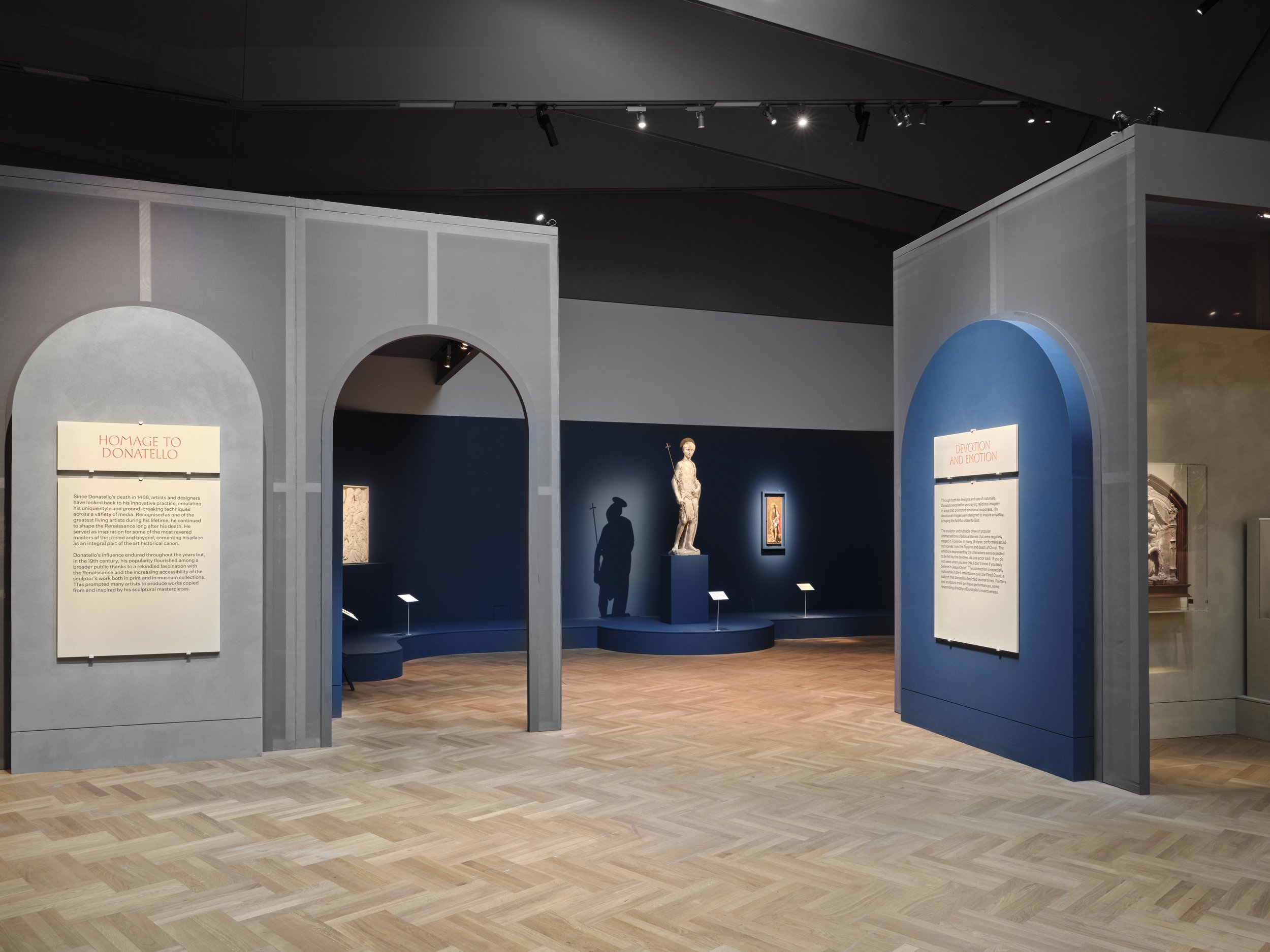
The inspiration for the design was the Florentine architecture of the Renaissance, cities designed around piazzas open public spaces joined by tighter street forms.
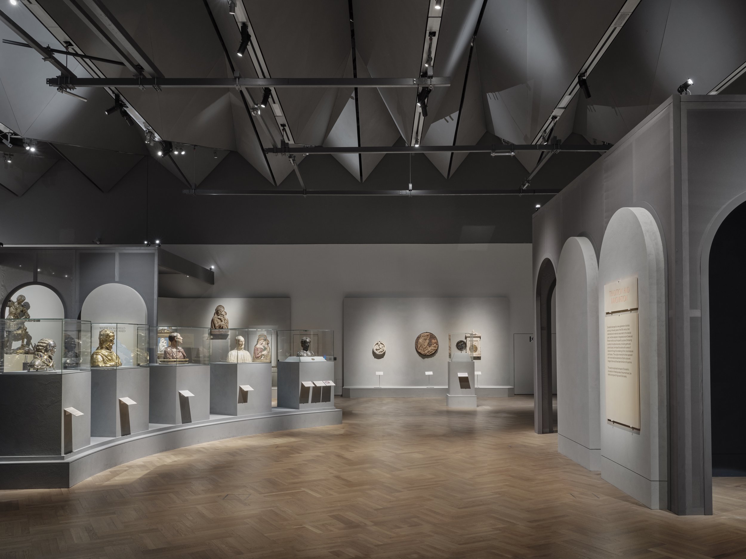
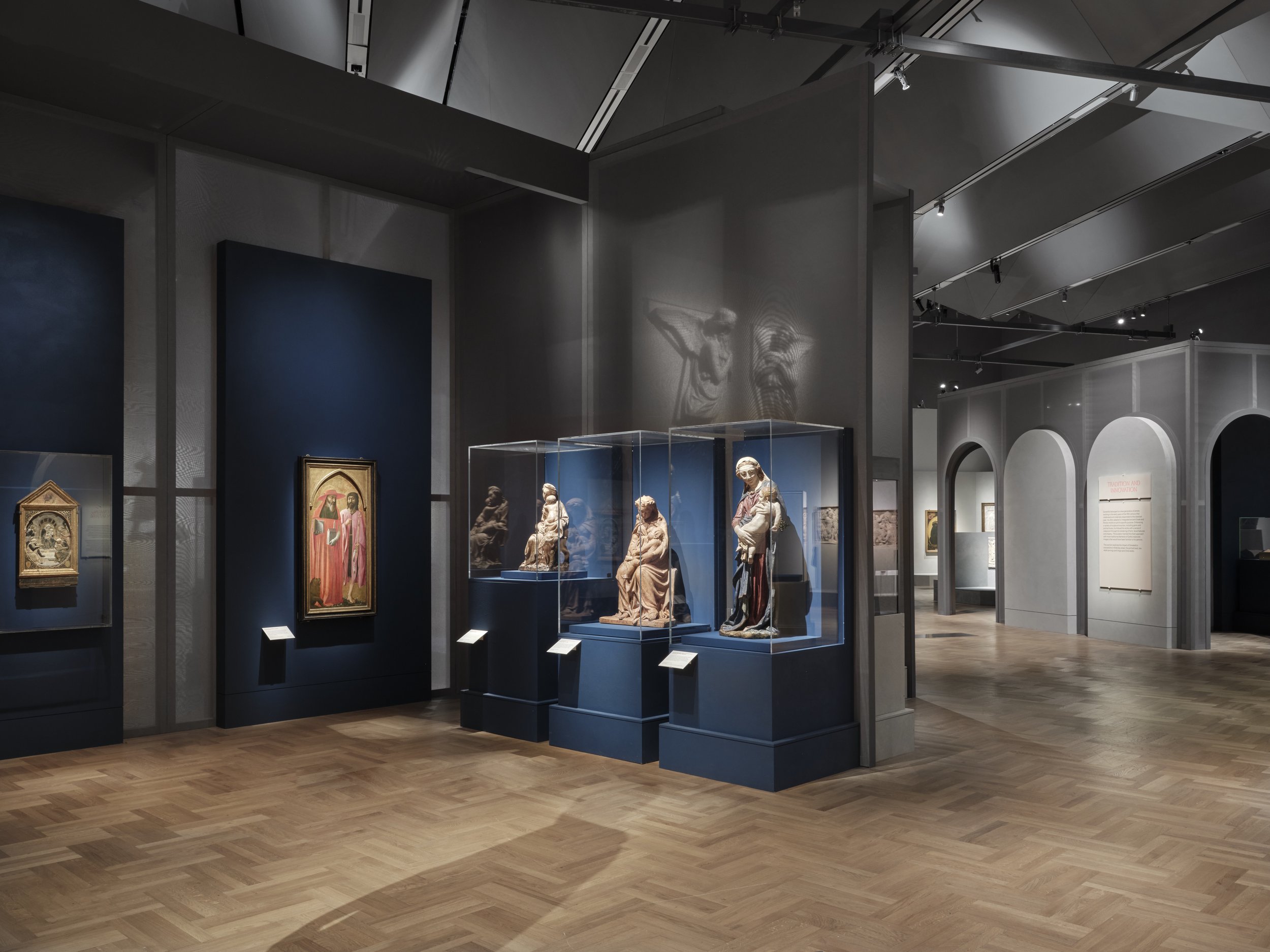
This was translated into plan of areas and vista of open airy display and area of enclosure that were darker and of higher contrast. This further developed to an interior architecture to house objects found in domestic or sacred interiors, with warm candle-like colour temperatures. Then always opening up to a central display of large outdoor sculptures in the more luminous piazza type spaces.
Amanda Levete designed the new Sainsbury wing gallery and for the first time since it opened in 2017, due to conservation requirements, we designed a scheme to enable half the rooflights to be opened to allow daylight to penetrate the space below.
We then mimicked this effect of diffuse daylight by up lighting the roof structure above the other piazza open displays to create modulations of more diffused light, in cooler colour temperatures, as you journey through the space. We used daylight sensors connected to Bluetooth light sources to control the amount of artificial light falling on the objects and change this according to the amount of daylight to ensure exposure levels remained within conservation targets.
The design though simple evokes the Florentine classical architecture of arches and columns which we highlighted to add a rhythm to the transitions from outdoor to indoor. The structure was built to be demountable with a re-useable metal framework. This was then wrapped in various densities of scrim to allow for various transparencies, the lighting again was used to create more solid architecture by front lighting the scrims and more translucency by lighting objects more brightly behind. Bespoke lighting was designed for showcased and integrated setworks to be best render the detailing of this exquisite works, particularly challenging with the shallow marble reliefs where we balance a grazing light with and diffused source to render the work without creating hard shadow lines that distract from the fine line work.
A series of spaces is created by the lighting and the lightweight architecture. A sequence of public and more private spaces. it creates effectively a choreography between objects and environment, a lit journey through space with points of focus and drama.
Client: Victoria & Albert Museum
Exhibition Design: V&A Design Studio
Contractor: Sam Forster
Photography: Thomas Adank


