Cromwell Road Visitor Entrance Experience Remodel
V&A Museum, London
Studio ZNA worked with architecture and design practice, Sam Jacobs Studio and the V&A team to remodel one of the most iconic entrance ways in UK public buildings, the V&A Museum’s historic Cromwell Road entrance. The design response works to complement the existing Aston Webb designed grade I listed building in a contemporary way.
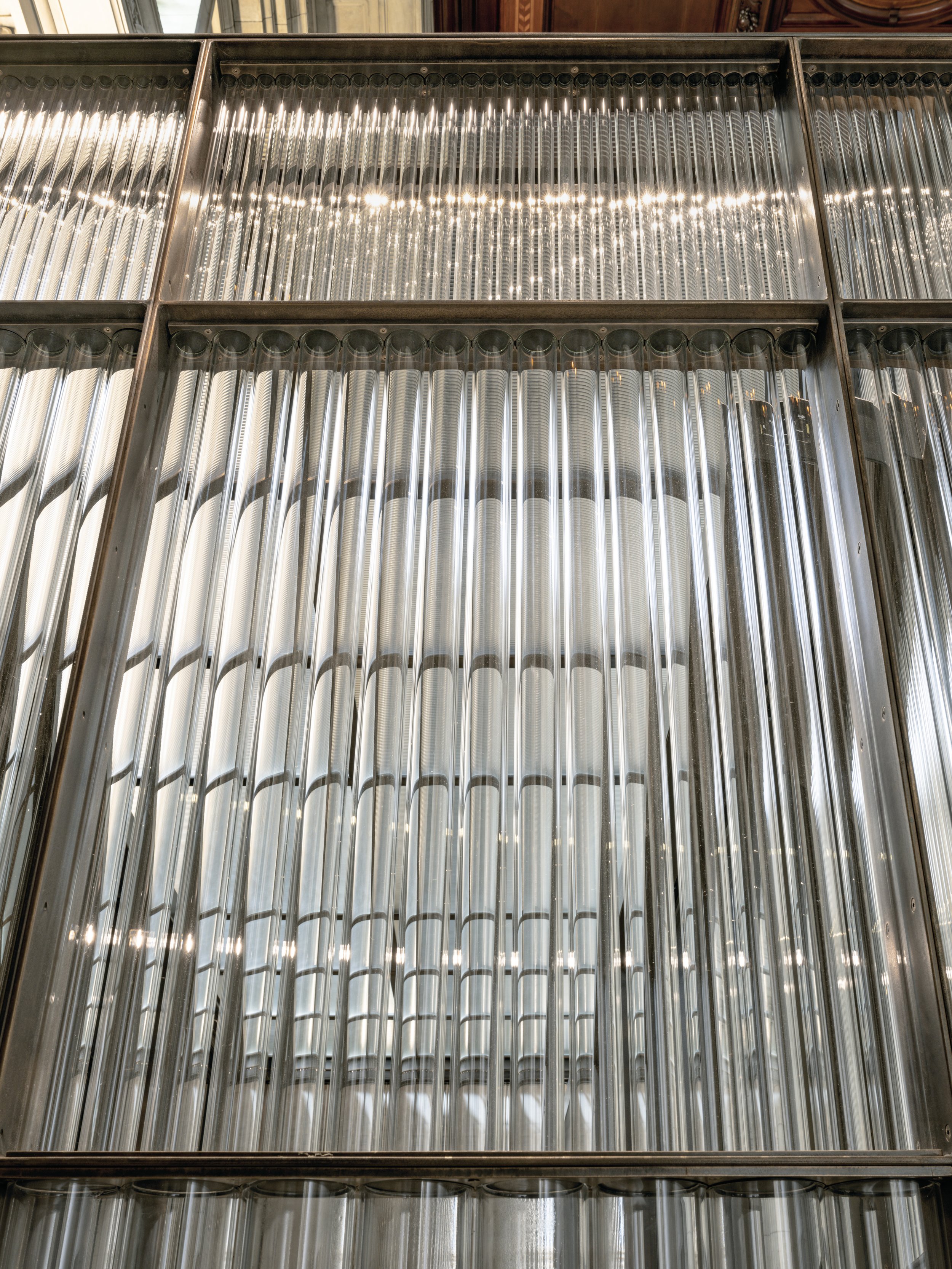
The new design is formed by three bands of glass tubes of differing diameters on lower, mid and upper levels. The glass produces optical distortions that accentuate the movement of people as they pass through the entrance. It also captures and projects daylight into the museum, with the whole structure helping to illuminate the interior, creating a dynamic and much more open threshold to the building. Glass here is used for the way it transmits light. We aimed to keep the lighting integration as minimal in depth as possible to allow the bronze framework to retain its streamlined appearance. We specified micro recessed spots with aged bronze finish to match to create local sparkle. Then at high level we used beam shaping lights to refract through the tubes to echo beams of light created by daylight which increase in intensity during non-daylit hours.
The Reception Desk continues this materiality and play with transparencies. Here the glass tubes are bathed in a warm glow delivered by concealed diffused linear source to express form and create a warm inviting vista to attract the visitor to the heart of the reception hall. The space is frequently used for events; for this we designed the reception lighting to be tuneable colour mixing light when used as a bar to match the particular event look and feel - immediately transforming the space without the need for additional hardware.
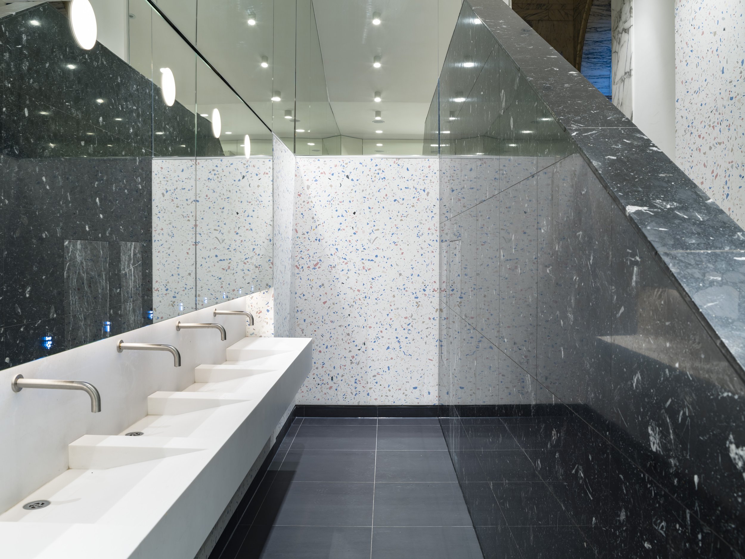
Part of the remodelling was also the WCs; SJS developed terrazzo wall panels that used rejected jasperware from Wedgewood’s factory in Stoke. We worked alongside the designers to develop a new LED lighting strategy to allow for visual comfort, accessibility compliance and proper cleaning and maintenance light levels.
Architecture and Design: Sam Jacob Studio
Contractor: Quinn
Photographer: Tim Soar


